A (Possibly) Disturbing Divergence on the General Market Overview Page
February 08, 2017
I've been noticing this while reviewing the Genreal Market Overview page for several days now and wanted to highlight it. I've written several times about how I use the "Percent of Stocks Above their 50-Day Moving Averages" (similar to Worden's T2108 indicator) as an overbought / oversold indicator. And I like it much better to signal oversold than overbought.
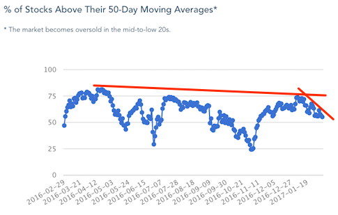
That indicator can also be used to guage how many stocks are participating in a broad market rise or decline. As the indices rise, I would expect to see the perecent of stocks above their 50-day moving averages rise as well. But that's not happening right now. As you can see from the image below, that been in a slow decline for almost a year now and it recently started a steeper decline. Given that the Nasdaq and S&P 500 are so close to all-time highs the graph is surprisingly close to the 50% mark.
There's clearly not broad participation in this rally. The million dollar question is will those lagging stocks weigh the market down or will the rising tide of the indices pull those laggards up.
site features moving averages Technical Analysis general market overview
Popular Now
Recent Comments
- TraderMike on BOOT
- Dr_Duru on BOOT
- TraderMike on Stochastic Reached Oversold
- SuccessfulGrasshopper897 on Stochastic Reached Oversold
- Cos3 on Adding float as advanced filter criteria?
From the Blog
Blog Tags
Featured Articles